Paper June
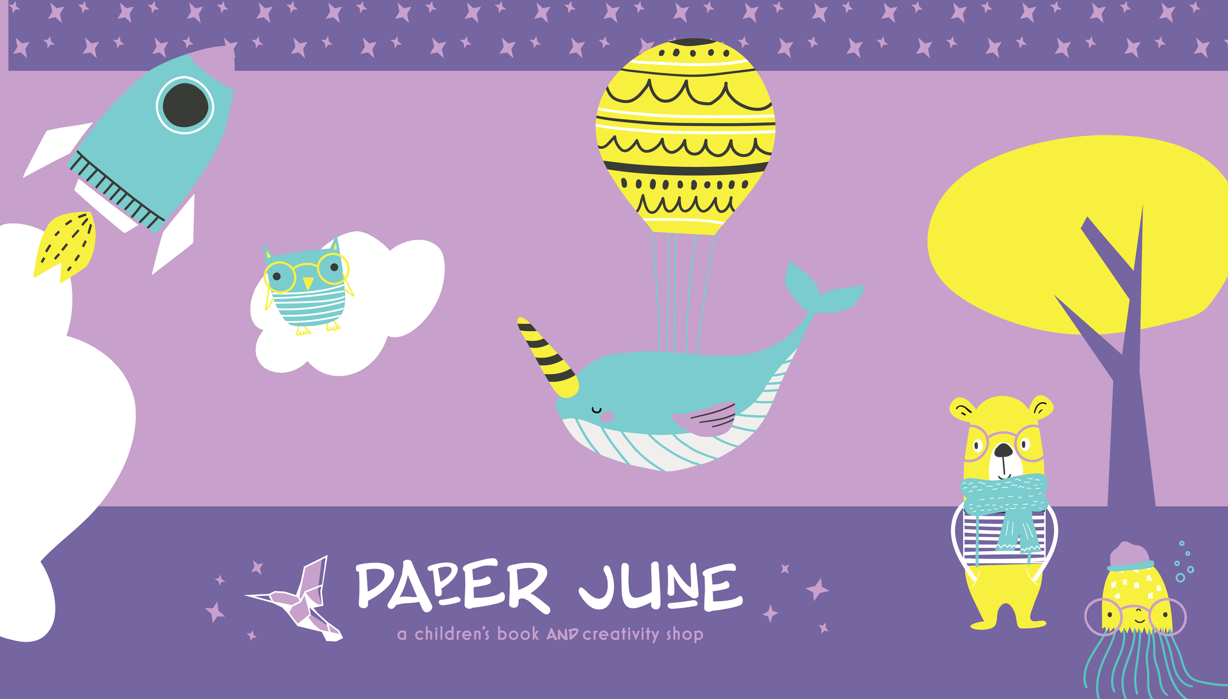
This business was born as a tribute to a loving mother. This client’s mom had a passion for reading to her children and it that spirit, a space where children can read, imagine, and discover new worlds was created. Each part of the brand was thoughtfully and intentionally created, using purple because it represents awareness of pancreatic cancer, a hummingbird because it was her mother’s favorite bird and an origami style icon to communicate the physical book aspect of their main service - selling unique, hand-selected children’s books.


