Mid-American
This Kansas City-based financial brand was ready for a change, even if they didn’t realize it at first. Their old identity felt disconnected—rooted in mountain imagery that had no relevance to the vibrant city where they actually worked and lived. The logo, while trying to convey tradition, was weighed down by an intricate combination of a compass and wheat—symbols that had lost their meaning and made the brand feel dated in a competitive financial landscape.
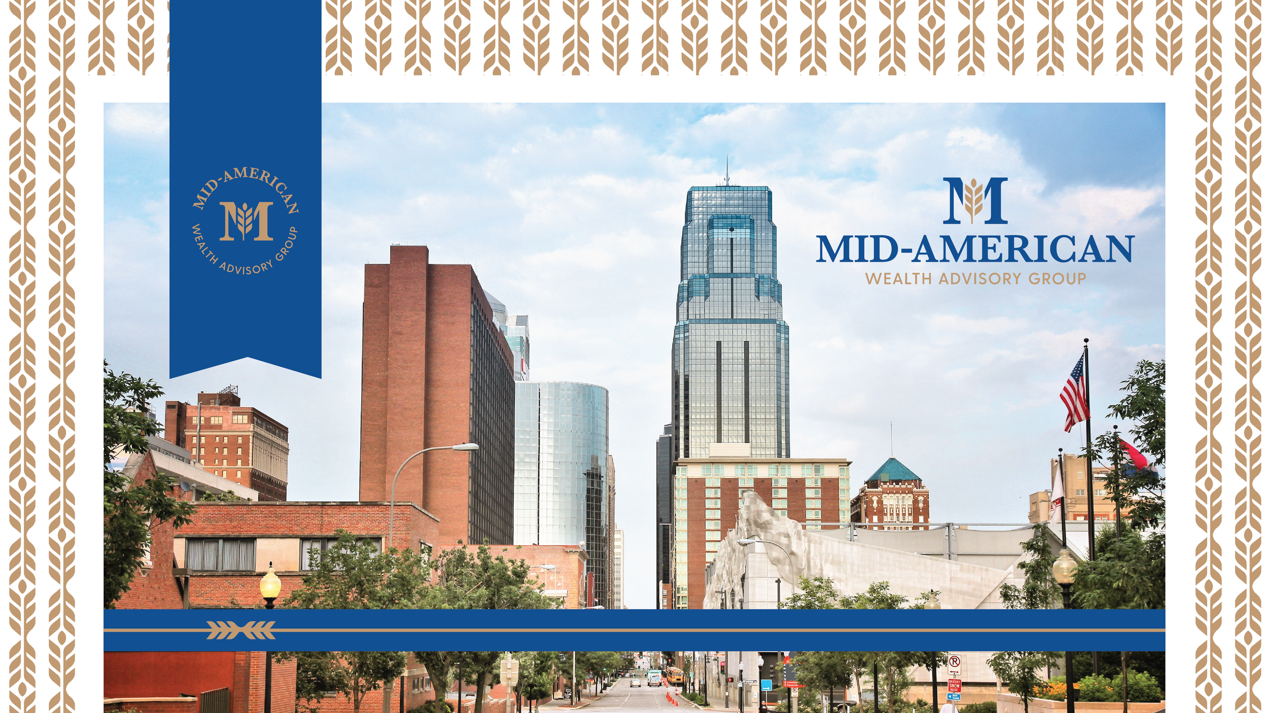
When it came time for a refresh, the solution was clear: bring the brand back home and craft a more authentic, modern identity that reflected Kansas City’s energy and the dynamic lives of their clients. We updated the visual language to include custom-tailored imagery showcasing Kansas City’s downtown skyline, outdoor dining, live concerts, high-end shopping, and other lifestyle elements that resonate with their audience.
The logo received a complete overhaul. We simplified the design, removing the overused compass and focusing on a refined wheat icon—a subtle nod to their Midwestern roots. By modernizing the typography and streamlining the overall look, we created a clean, sophisticated logo that stands out while staying true to the brand’s heritage.


